When people talk about premium design, they usually mean the visuals: rich photography, elegant type, a dark interface. Those matter. But in every shopping experience I have designed, the most premium feeling came from something invisible: there was simply less to do.
I have seen it in the Pirelli tire shopping app, in a luxury watch app and in the booking flow of Stanly Egypt, a luxury travel agency. In each case, removing steps did more for the experience than any visual detail.
Here is how I find the steps worth removing.
Map the Flow Before Drawing Screens
The data backs this up. The Baymard Institute puts the average cart abandonment rate at about 70%, and among shoppers who meant to buy, 17% left because checkout was too long or complicated. Baymard also found that the average checkout has 11.3 form fields, while most sites need only 8.
Before any visuals, I map every path a shopper might take, from the home screen to product details, cart, checkout and confirmation. Seeing the whole flow on one board makes the waste obvious: a screen that only confirms the previous one, a form that asks for something we already know, a detour that exists for internal reasons.
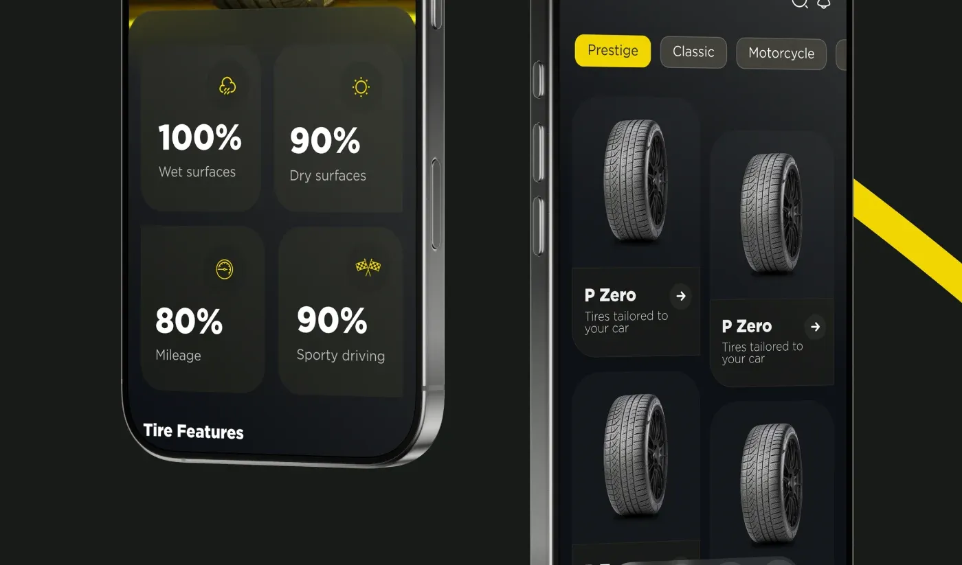
For Pirelli, the map also showed where shoppers lose confidence: understanding which tire fits their car, checking stock and finding a trusted dealer nearby. Those became the three pillars of the app.
Sign-in Should Never Be the Obstacle
Life is too short to be wasted on sign-ins, and shoppers agree: in Baymard's data, 18% abandoned because the site wanted them to create an account. On Pirelli, people log in with a phone number, recover a password with a code, and create an account on one short screen. Every extra field at the door costs customers who never see the products.
Give Confidence at the Moment of Doubt
A short flow is not enough if people hesitate. I place the reassurance exactly where doubt appears:
- On the product page, the numbers shoppers compare, like wet and dry grip, mileage and sporty driving.
- Before paying, a clear summary with no surprises in the total.
- After buying, where to go next: the nearest store with directions, ratings and opening hours.
Test the Shorter Path
Shorter flows should still be proven. When Stanly Egypt's booking journey was rebuilt with fewer steps, A/B testing showed a 20% higher conversion rate. Premium is not only how it looks. It is how little it asks of you.
Sources
- Cart Abandonment Rate Statistics, Baymard Institute
- Checkout Optimization: 5 Ways to Minimize Form Fields in Checkout, Baymard Institute