A guest planning a week in Mykonos is not comparing prices line by line. They are imagining the stay: the villa pool at sunset, a yacht to a quiet beach, a private chef for dinner, a car waiting at the door. What they want is one host who takes care of all of it.
Mykonos Hospitality Group (MHP) is that kind of luxury concierge: villa rentals, yacht charters, a personal chef and car rental, arranged by one team. Its website had to hold all of that without feeling like a catalogue.
Here is how the luxury concierge website was designed. The full project is in the Mykonos Hospitality Group case study.
One Host for Every Service
The first thing guests need to understand is the breadth of the offer. "A Selection Of Our Most Popular Luxury Services" shows it as four tall photo cards: Villa Rentals, Yacht Charter, Personal Chef and Car Rental, each with a name and a View More link.
Cards suit this job. Nielsen Norman Group describes cards as containers for a few short, related pieces of information that act as an entry point to more detail, which is exactly what a service overview needs. Four cards, one image each, and the guest sees the whole stay at a glance.
Photos Are the Product
In hospitality, the photograph is what the guest is buying. So the MHP interface is dark and almost colorless, with classic serif headlines, and every bit of color comes from the villas, the pools, the boats and the sea.
Big images are not automatically better. NN/g's research on image-focused design shows large imagery helps when the images carry the information people need, and hurts when it pushes that information away. That is why every large photo on the MHP site comes with its facts: the villa's name, how many it sleeps, its beds and bathroom, and a Book button right on the image.
Sliders Guests Control
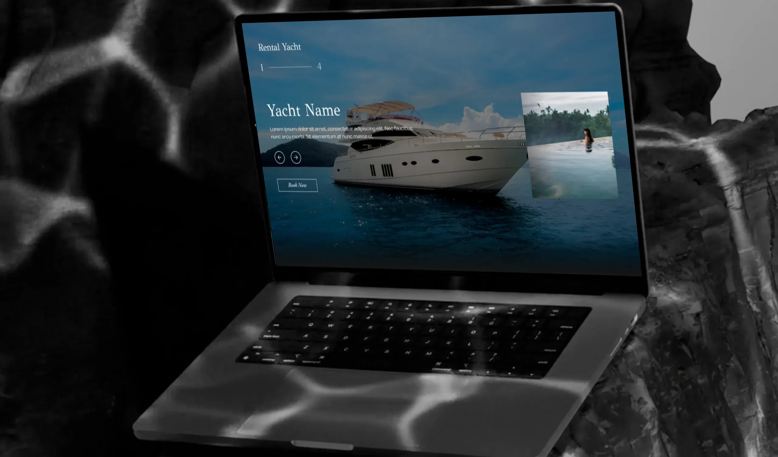
Villas and yachts are shown one at a time, full screen, with the next ones peeking in at the edges and a counter like "1 — 4" so guests always know how many there are.
They move only when the guest moves them. NN/g found that auto-forwarding carousels annoy users and reduce visibility, because content slides away before people finish reading. With arrows and swipes instead of a timer, a guest can stay on Alkyoni as long as they like.
Calm Navigation, Visible Actions
The full menu, Home, About us, Villas rental and Services, opens as a full-screen panel in large serif type, which keeps the pages clean. But hiding navigation has a cost: NN/g measured that hidden navigation hurts discoverability, especially on desktop.
So the actions that matter never hide. "Explore Villas" and "make a plan" sit in the hero, and "Let's talk" stays in the header on every page, because a concierge business runs on conversation.
Beauty That Builds Trust
Guests hand one company their whole holiday, so trust is part of the design. The aesthetic-usability effect explains why polish matters here: people perceive attractive designs as easier to use and forgive small issues more readily.
Beauty alone is not enough, though. The About page backs it with a story, "Since 2010. We have shaped the future of Mediterranean hospitality across four generations", and villas, yachts, chefs and cars all share one layout and one booking action. In a luxury concierge website, consistency is what turns a beautiful page into a booking.
Sources
- Cards: UI-Component Definition, Nielsen Norman Group
- Image-Focused Design: Is Bigger Better?, Nielsen Norman Group
- Auto-Forwarding Carousels, Accordions Annoy Users & Reduce Visibility, Nielsen Norman Group
- Hamburger Menus and Hidden Navigation Hurt UX Metrics, Nielsen Norman Group
- The Aesthetic-Usability Effect, Nielsen Norman Group