A creative agency website has an unfair job. Every other business uses its site to describe what it sells; an agency's site is what it sells. If the website looks ordinary, clients assume the work will be ordinary too.
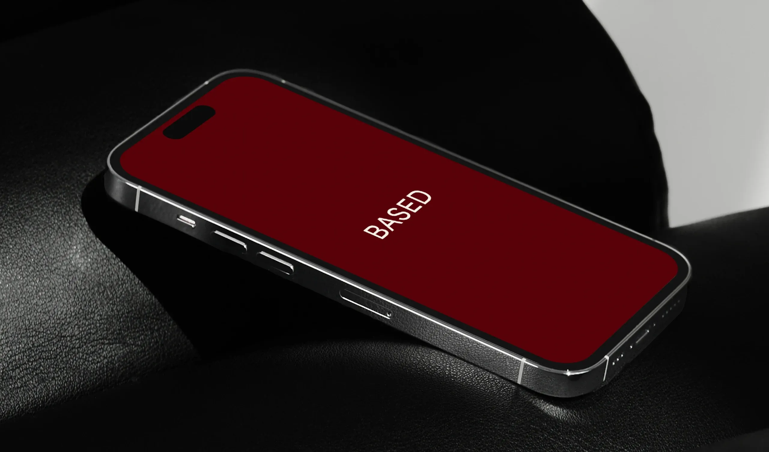
BASED is a creative studio in Saudi Arabia that builds brands for companies like the Saudi Investment Company, Nabtat and Mat Cookies. When I designed its website, the goal was to prove the studio's taste before a visitor read a single paragraph.
Here is how the creative agency website was designed. The full project is in the BASED case study.
You Have Seconds, Not Minutes
Nielsen Norman Group's analysis of how long users stay on web pages found that people often leave within 10 to 20 seconds, and that pages with a clear value proposition hold attention far longer.
So the BASED hero carries the whole brand in one line: "Designed beautifully. Shaped purposefully." Heavy type, a small image set inside the headline and a deep red motion photo below say what the studio does and how it does it before anyone scrolls.
Put the Work First
Clients hire agencies for their portfolio, not their adjectives. That is why "Selected Work" arrives right after the hero, as a numbered, asymmetric grid of real projects instead of a slider or a wall of identical thumbnails.
The work page goes further: each project is a wide row with its name, the disciplines as small tags, such as Branding, Social Media and Animation, and a large image, so visitors looking for one kind of work can find it at a glance.
Hierarchy Does the Talking
With so much imagery, the layout has to tell people where to look. NN/g defines visual hierarchy as the arrangement of elements to show their order of importance, using size, color, contrast and spacing.
BASED uses exactly three levels: big grotesque headlines, small monospaced labels like CREATIVE STUDIO and SAUDI ARABIA, and plain body text. One bold red against warm off-white and black marks what matters, so the page feels loud without being noisy.
Show How You Think
Beautiful work earns attention, and the aesthetic-usability effect means people also find polished designs easier to use. But clients are buying a partner, not only pictures. NN/g's research on About Us information shows visitors want to know who is behind a company and what it stands for.
BASED answers that twice. "What We Bring" explains its belief that great design begins with clarity and purpose, with five clear promises, from Competitive Edge to Lasting Impact. And the Journal publishes the studio's thinking, like "The Art of Minimalism", giving clients a reason to trust it and search engines a reason to return.
Sources
- How Long Do Users Stay on Web Pages?, Nielsen Norman Group
- Visual Hierarchy in UX: Definition, Nielsen Norman Group
- "About Us" Information on Websites, Nielsen Norman Group
- The Aesthetic-Usability Effect, Nielsen Norman Group