Nobody browses law firm websites for fun. People arrive worried: a dispute with a partner, a contract that went wrong, a company to set up before a deadline. They are judging one thing above all else: can I trust these people?
When I designed the website for NAL Lawyers, a Saudi law firm formed from three established legal entities, that question shaped every screen. The answer was not more gold, marble or gavels. It was clarity.
Here is how the NAL Lawyers law firm website was designed to earn trust. The full project is in the NAL Lawyers case study.
Plain Language Over Legal Jargon
Legal writing has a reputation for being dense, and many law firm websites copy that tone. It feels authoritative to the firm and exhausting to everyone else. Nielsen Norman Group's research shows that plain language works even for expert readers: people prefer short, scannable text, and organizations that write clearly are seen as more transparent and credible.
So NAL's website speaks plain Arabic. The home page says what the firm does in one line, "We empower with confidence… and invest in solutions", and each service page explains what the service is and when you need it before any legal detail.
Proof Before Promises
A new name raises a fair question: is this firm experienced? NAL's answer sits right on the About section, in large numerals: more than 2,000 completed cases, more than 3,000 legal services and more than 450 clients. Beside them, one short paragraph explains how three legal entities joined forces as one firm to keep pace with Saudi Arabia's Vision 2030.
NN/g's research on About Us pages found that visitors want to know quickly what a company does, who is behind it and how to reach it, and that vague, jargon-heavy content undermines confidence. The numbers and the story answer all of that in seconds.
People Hire People
Choosing a lawyer is personal, so the site shows the people. The Team page introduces the lawyers by name and role, and the photography shows real moments: a team reviewing a case, a signed agreement, a handshake across a desk.
That is not decoration. NN/g's eyetracking studies on photos as web content show that people look closely at images that carry real information, like photos of actual staff, and ignore generic stock images.
One Clear Next Step
Someone facing a legal problem should never wonder what to do next. Every page of the NAL website ends with the same question, "Are you ready to start a clear path towards legal solutions?", and a single contact button. One obvious action beats a menu of options when people are under pressure.
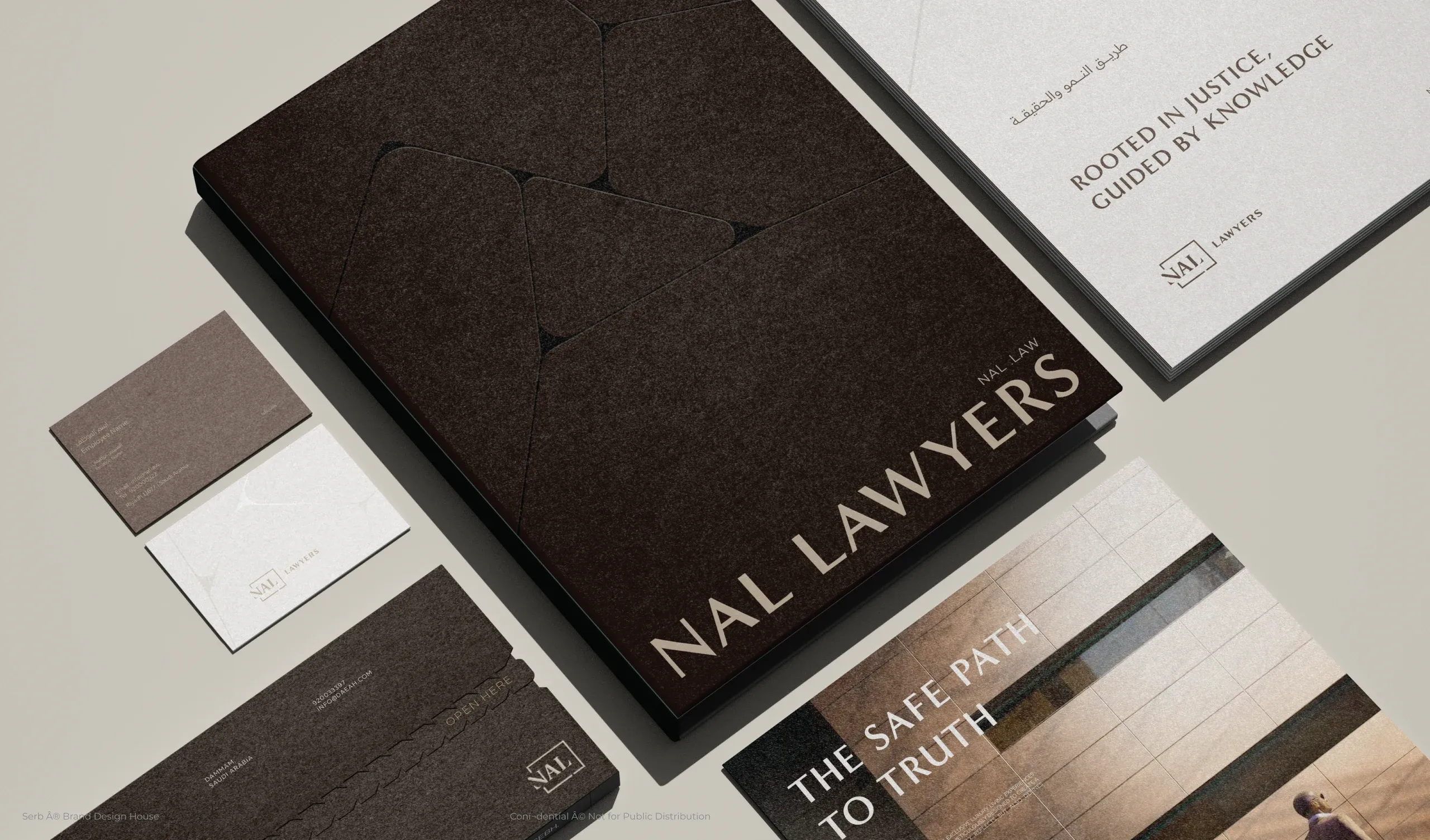
Around it, a restrained brand of deep brown and taupe, a framed NAL monogram and the line "The safe path to truth" keep the whole experience calm. In a law firm website, calm is not a style. It is a promise.
Sources
- Plain Language Is for Everyone, Even Experts, Nielsen Norman Group
- "About Us" Information on Websites, Nielsen Norman Group
- Photos as Web Content, Nielsen Norman Group