


NAL Lawyers
The safe path to truth: an Arabic-first website and brand for a Saudi law firm built on trust.
- Role
- UI/UX Designer
- Timeline
- 2025
- Team
- Solo designer
- Platform
- Web & social, Arabic-first
The Real Problem
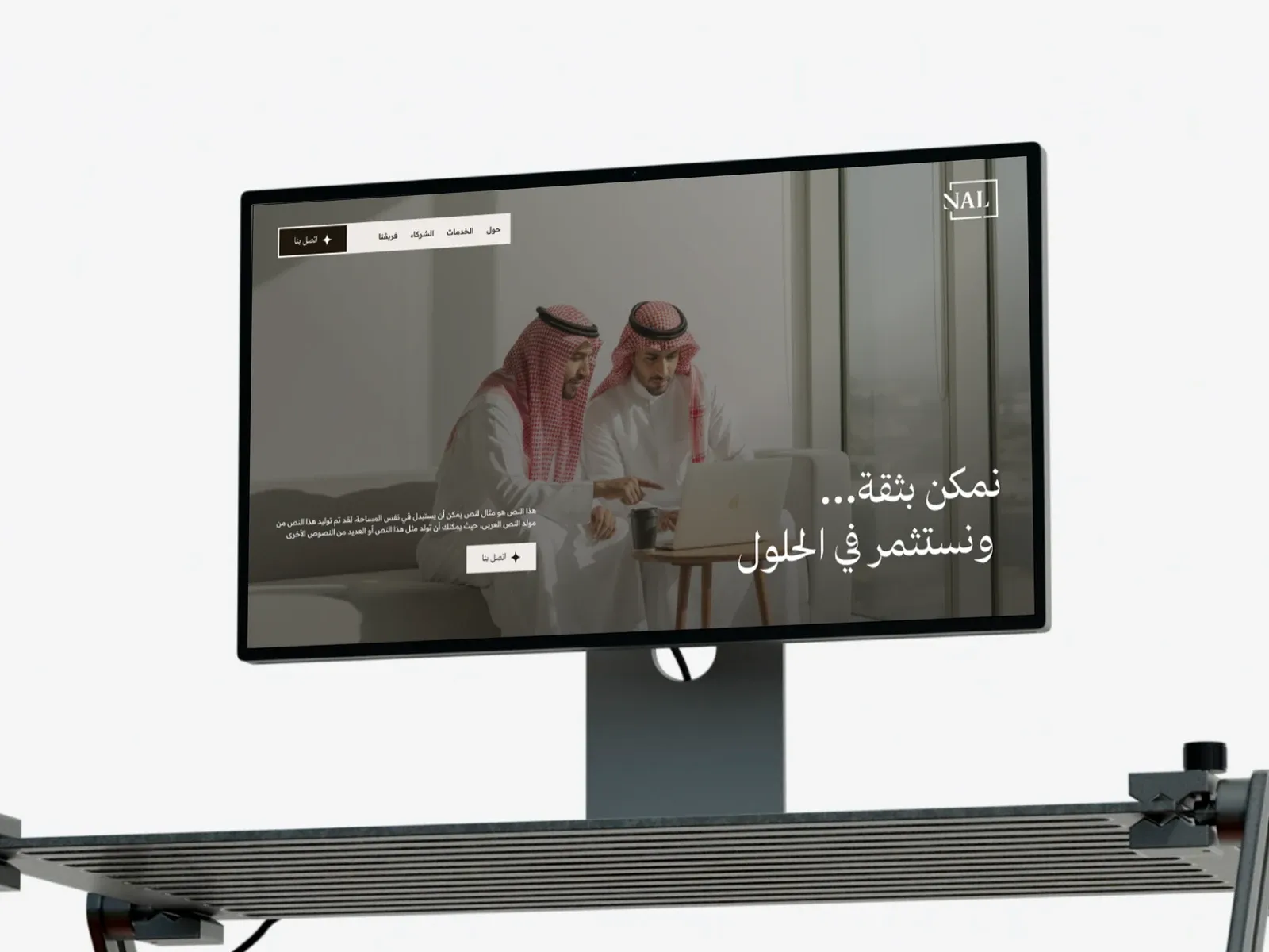
NAL Lawyers was formed when three legal entities, each with long experience, wide relationships and deep knowledge, came together as one firm. The goal was to keep pace with Saudi Arabia's Vision 2030 and to be known for excellence in the legal services it provides.
A merger like that needs a new public face. People looking for a lawyer are often worried and short on time, so the law firm website had to feel calm and trustworthy, explain what NAL does in plain Arabic, and make the first contact easy. This case study follows the NAL Lawyers law firm website UI/UX design and the brand around it.
Finding the Direction
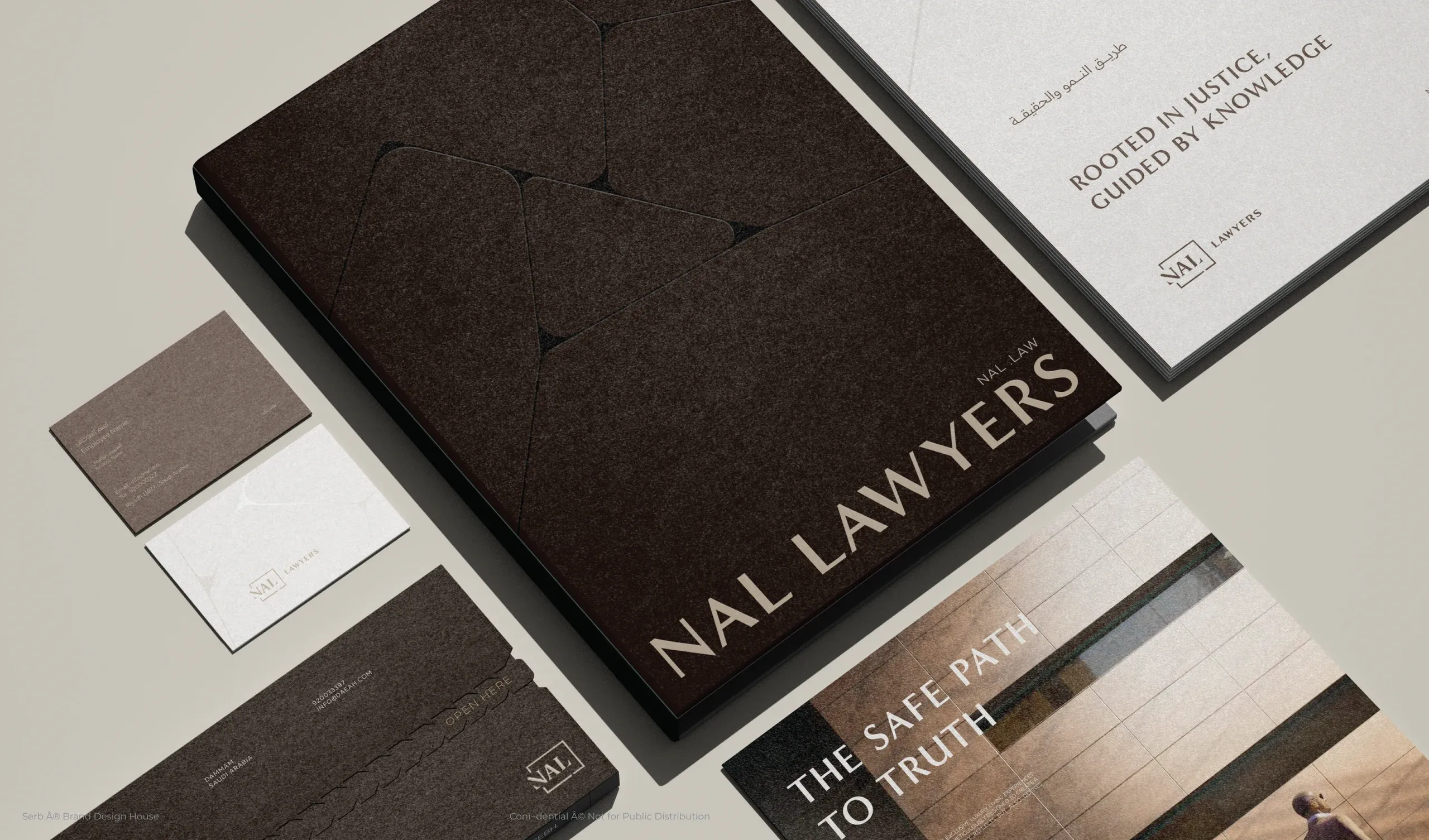
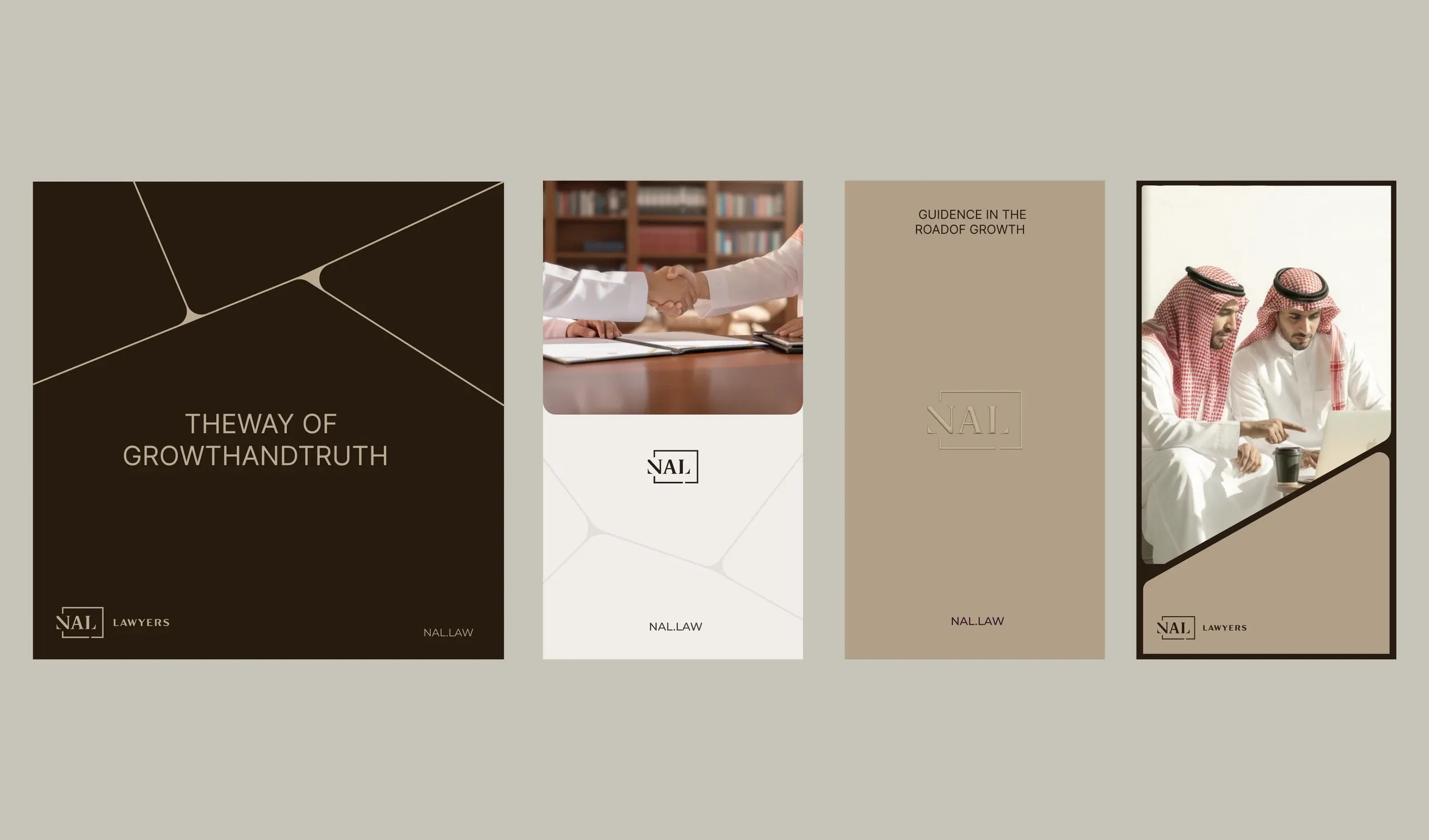
Legal brands often reach for marble, gold and gavels. NAL needed something quieter and more confident. The identity is built on two lines: "Rooted in justice. Guided by knowledge." and "The safe path to truth."
A framed NAL monogram, a palette of deep brown, warm taupe and soft stone, and a fine angled line motif carry those ideas across the website, business cards, folders and letterheads.
Proof Before Promises
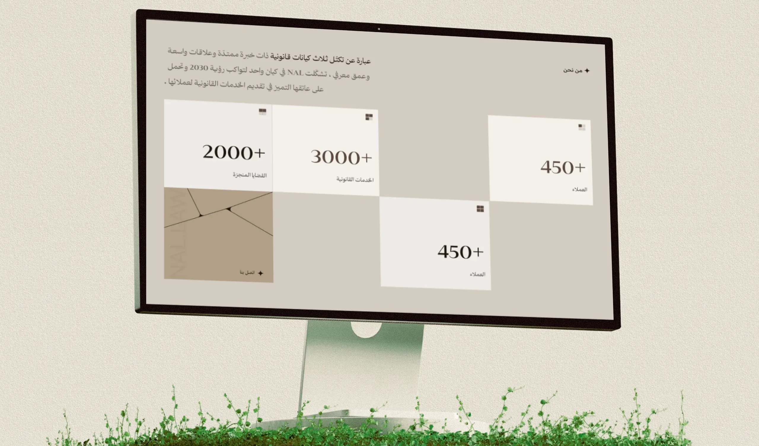
Trust in a law firm comes from track record, so the About section leads with numbers set large on a calm grid: more than 2,000 completed cases, more than 3,000 legal services and more than 450 clients.
Next to them, one short paragraph tells the story of the three entities that became NAL, so the numbers have a reason behind them.
Pages for Every Question
- Home. "We empower with confidence… and invest in solutions", over a photograph of the team at work, with About, Services, Partners, Team and Contact always one tap away.
- Values. An animated section that reveals the firm's values one by one.
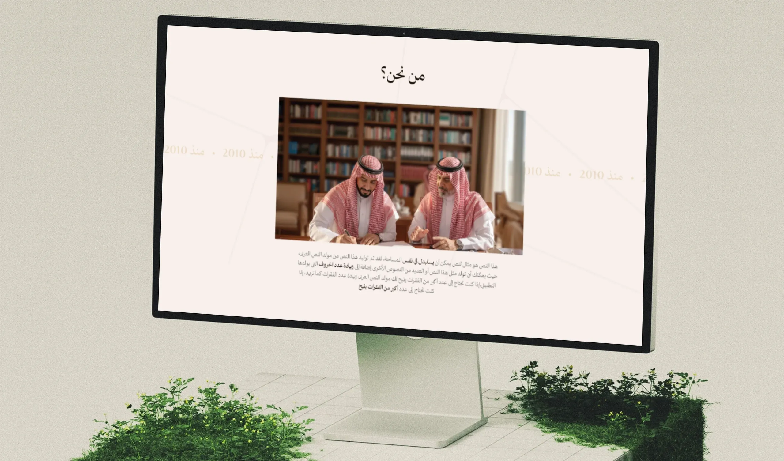
- Services. Each legal service on its own page, explained in plain language and illustrated with real moments, such as a signed agreement.
- Team. The lawyers behind the firm, because people hire people.
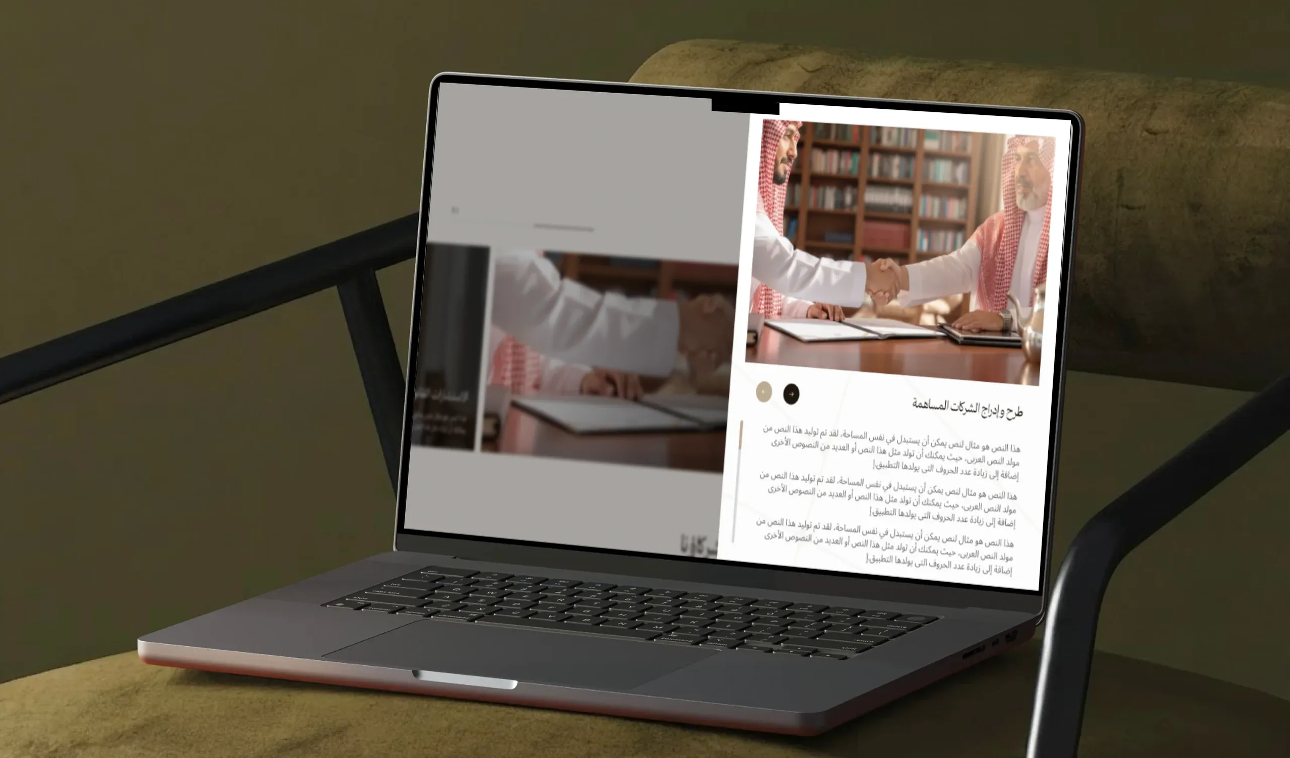
One Clear Next Step
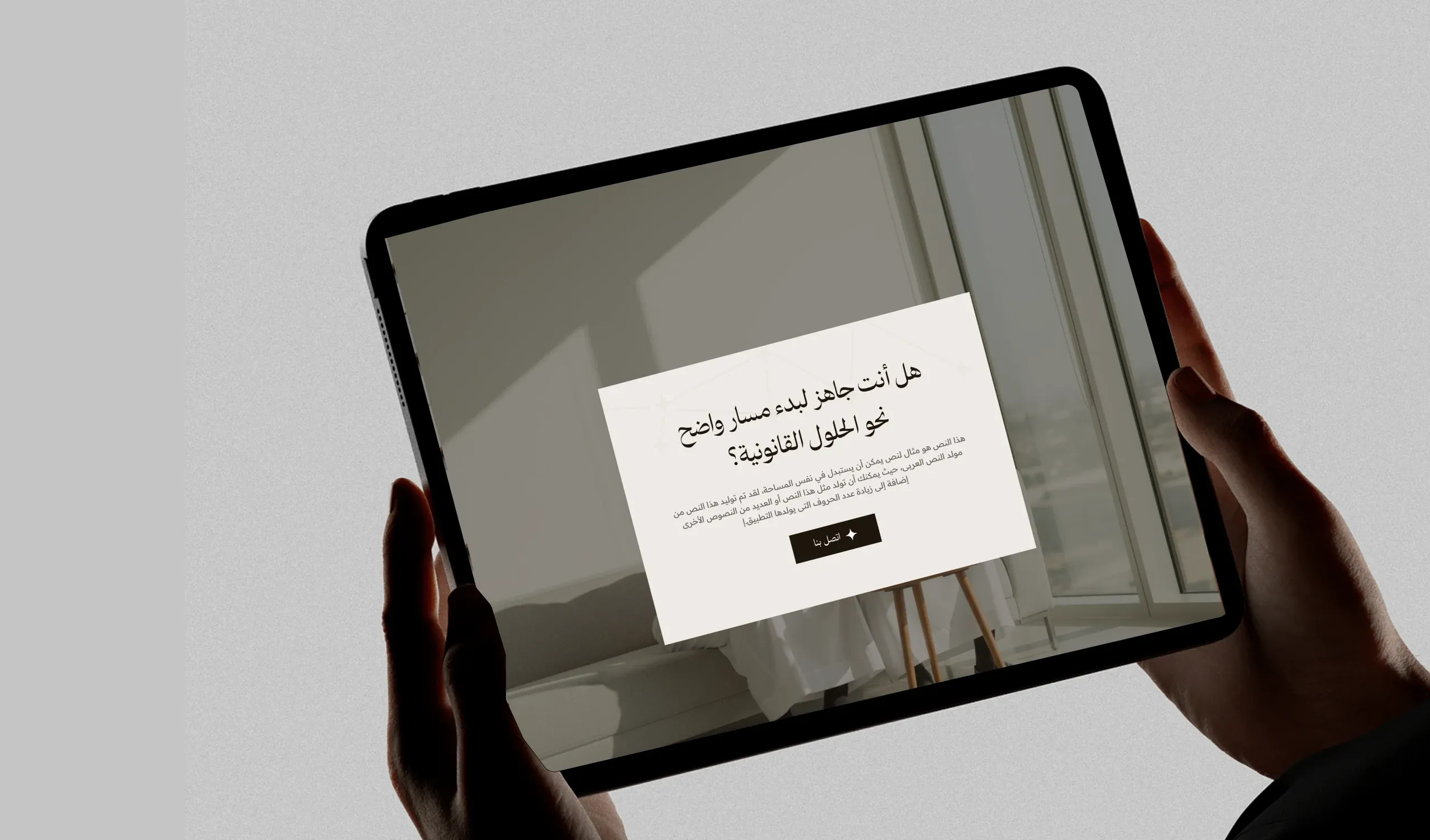
Every page ends with the same question: "Are you ready to start a clear path towards legal solutions?" and a single contact button. For someone facing a legal issue, one obvious next step is worth more than a menu of options.
The whole site is designed Arabic-first and right-to-left, for desktop, tablet and mobile.
Beyond the Website
The same system runs through NAL's social media: deep brown and taupe posts with the angled line motif, real photography and short lines like "The way of growth and truth", so the firm looks like one practice everywhere it appears.
What I Learned
Calm is a design decision. Restraint in color, type and motion made the firm feel more trustworthy than any symbol of justice could.
Numbers speak for a merger. Showing the combined track record answered the question every client has: can I trust a new name?
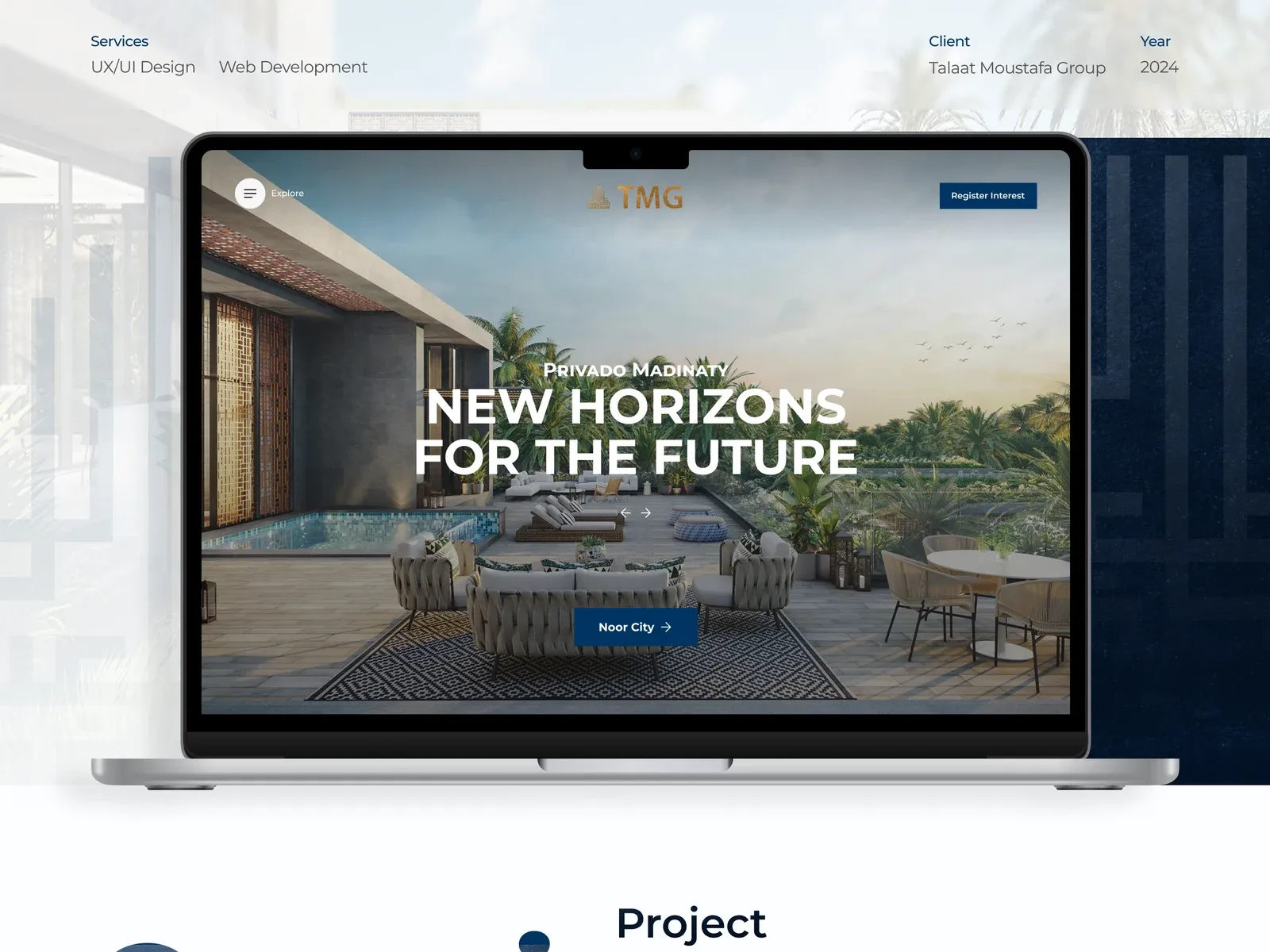
TMG – Talaat Moustafa Group
Egypt's largest planned communities needed a website as well planned as they are.
Real estateCorporate web