It is easy to design a mobile app at a desk: a large monitor, a fast connection, all the time in the world. The drivers who use the Naqla app have none of that. They are on the road, often with weak signal, a phone in a holder and a delivery waiting.
Naqla is Egypt's first trucking platform, connecting shippers with trusted carriers. When we redesigned its driver app, the most useful thing we did was stop imagining the user and start studying their day.
These are the lessons that changed the design.
Research the Context, Not Just the User
Surveys, interviews and usability tests told us who the drivers were, but the real insights came from their circumstances. Drivers lost shipment details when they drove through areas with poor coverage. Business owners managing several drivers struggled to switch accounts and assign jobs. New users did not trust an app that asked for their national ID without explaining why.
None of these are visual problems, and no amount of polish would have fixed them. They only show up when you look at where and how the app is used.
Design for a Glance
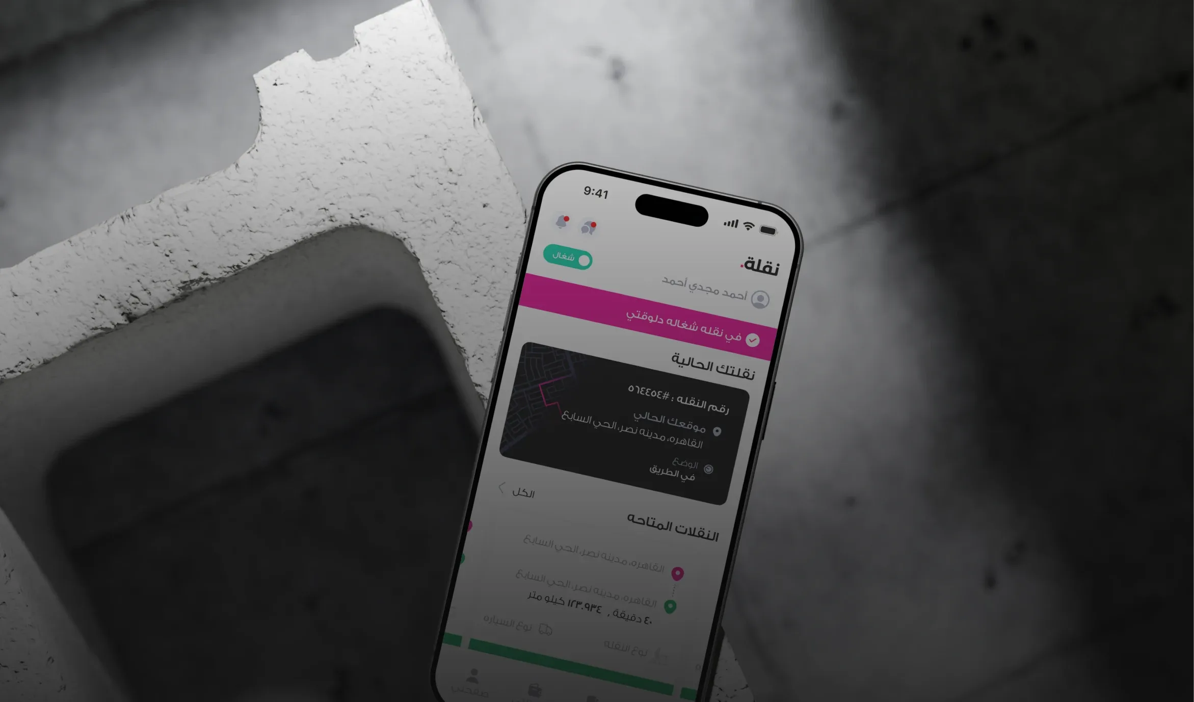
A driver checks the app in short moments. Nielsen Norman Group reports that an average mobile session lasts about 72 seconds, less than half of a desktop session, and recommends saving state so interrupted people can pick up where they left off. So every screen has to answer its main question in one look. The home screen shows the driver's state, the trip in progress and the available trips, nothing more. Trip cards show what matters for accepting a job: the car type, pick-up and drop-off times, price and points.
Touch targets follow NN/g's advice of at least 1 cm × 1 cm, and often more for a phone in a moving truck. Large touch targets, strong contrast and clear states (accepted, in progress, done) matter more here than in almost any other product.
Plan for Offline From Day One
Offline support is usually treated as a technical detail. For drivers, it is the difference between finishing a job and calling the support line. We made sure trip details and the information drivers need on the road stay available without a connection, and that the app tells them clearly when something is waiting to sync.
The redesigned app now serves more than 10,000 drivers, and task completion improved by 35%. Most of that came from respecting the road, not from decoration.
Sources
- Mobile User Experience: Limitations and Strengths, Nielsen Norman Group
- Touch Targets on Touchscreens, Nielsen Norman Group