


Saudi Investment Company
A developer of commercial landmarks deserved a website as considered as its buildings.

- Role
- UI/UX Designer
- Timeline
- 2025
- Team
- Solo designer
- Platform
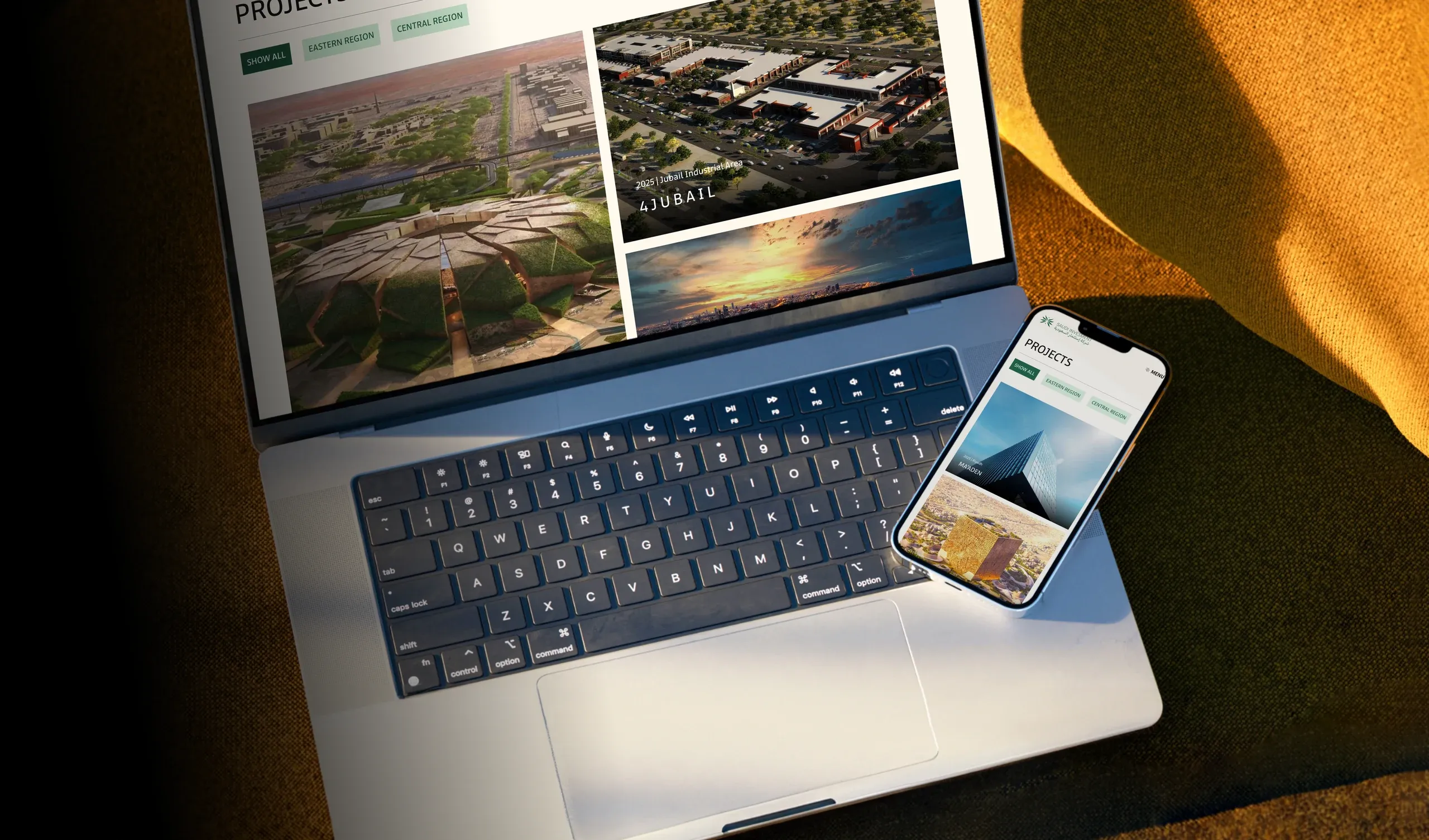
- Web, desktop to mobile
The Real Problem
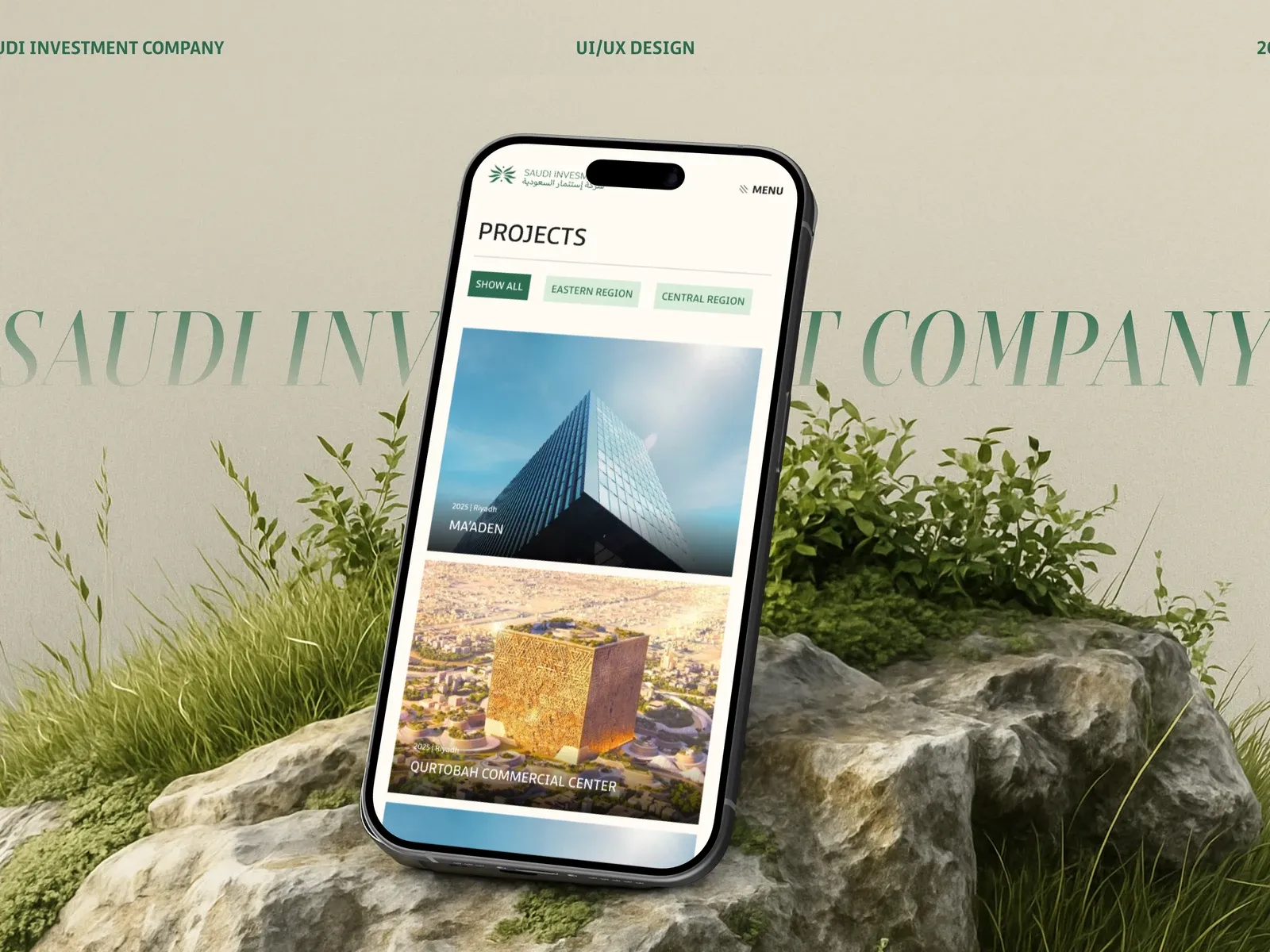
Saudi Investment Company (SICO) has developed and leased commercial property since 2005, from its headquarters in Riyadh and a branch in Dammam. Its strengths are real but complex: strategic locations, the right tenant mix and its own operating companies, Eshraf for project management, Nabtat for landscaping and Franchise for property management.
Investors and tenants needed to grasp all of that quickly. The website had to reflect the architectural quality of SICO's projects and make a long, detailed company story feel simple: a commercial real estate website design that works for investors in Riyadh and beyond.
Finding the Direction
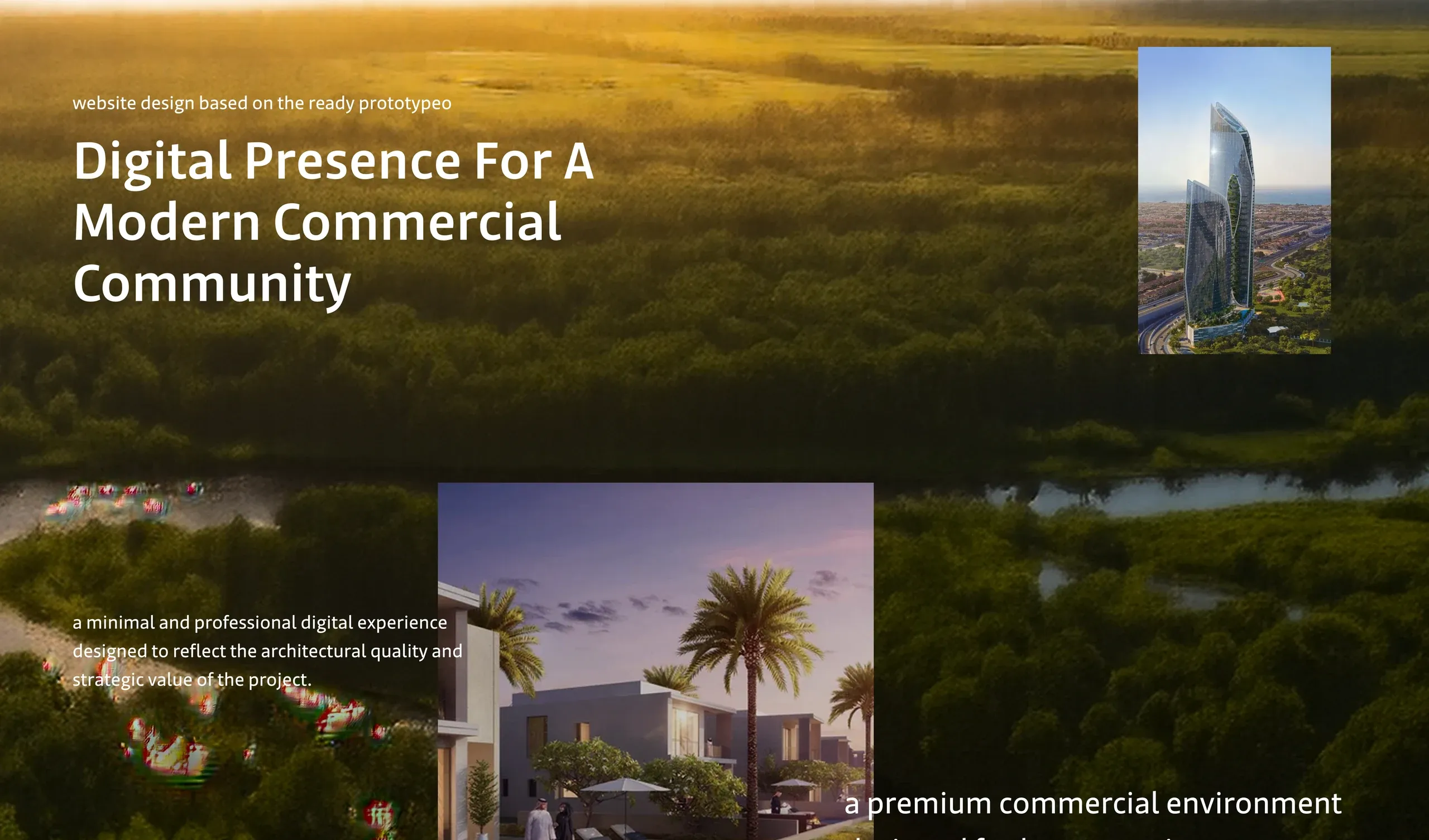
I started from a ready prototype and refined it into a minimal, professional experience. One belief shaped the tone: every structure begins with a story, and the best spaces reflect the dreams and lives of the people who use them.
The campaign tied SICO to Saudi Arabia's Vision 2030 with lines like "Investing in growth. Building the future."
The Style Guide
- Typeface. Arabic Jali, from Light to Bold, for a confident bilingual voice.
- Colors. A deep green primary (#2D6B50) with a soft green, white and two grays.
- Breakpoints. Desktop at 1920 and 1380, tablet at 768 and mobile at 360.
Five Pages, One Story
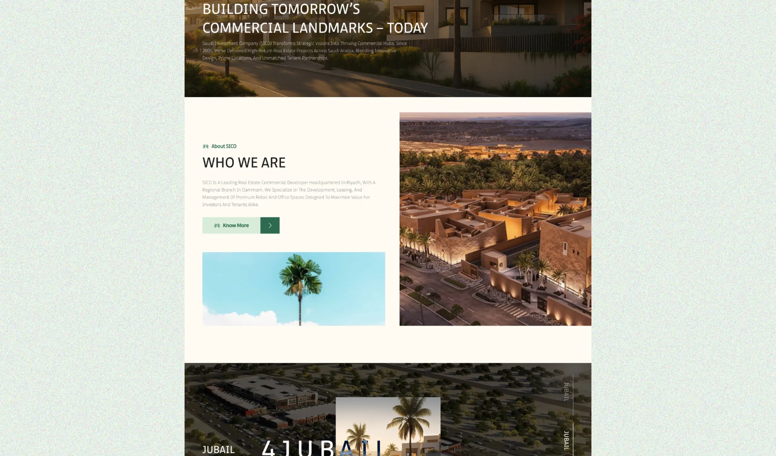
- Home. "Building tomorrow's commercial landmarks, today": who SICO is, a featured project, and why partner with them. End-to-end expertise through its own subsidiaries: no middlemen, no delays, just results.
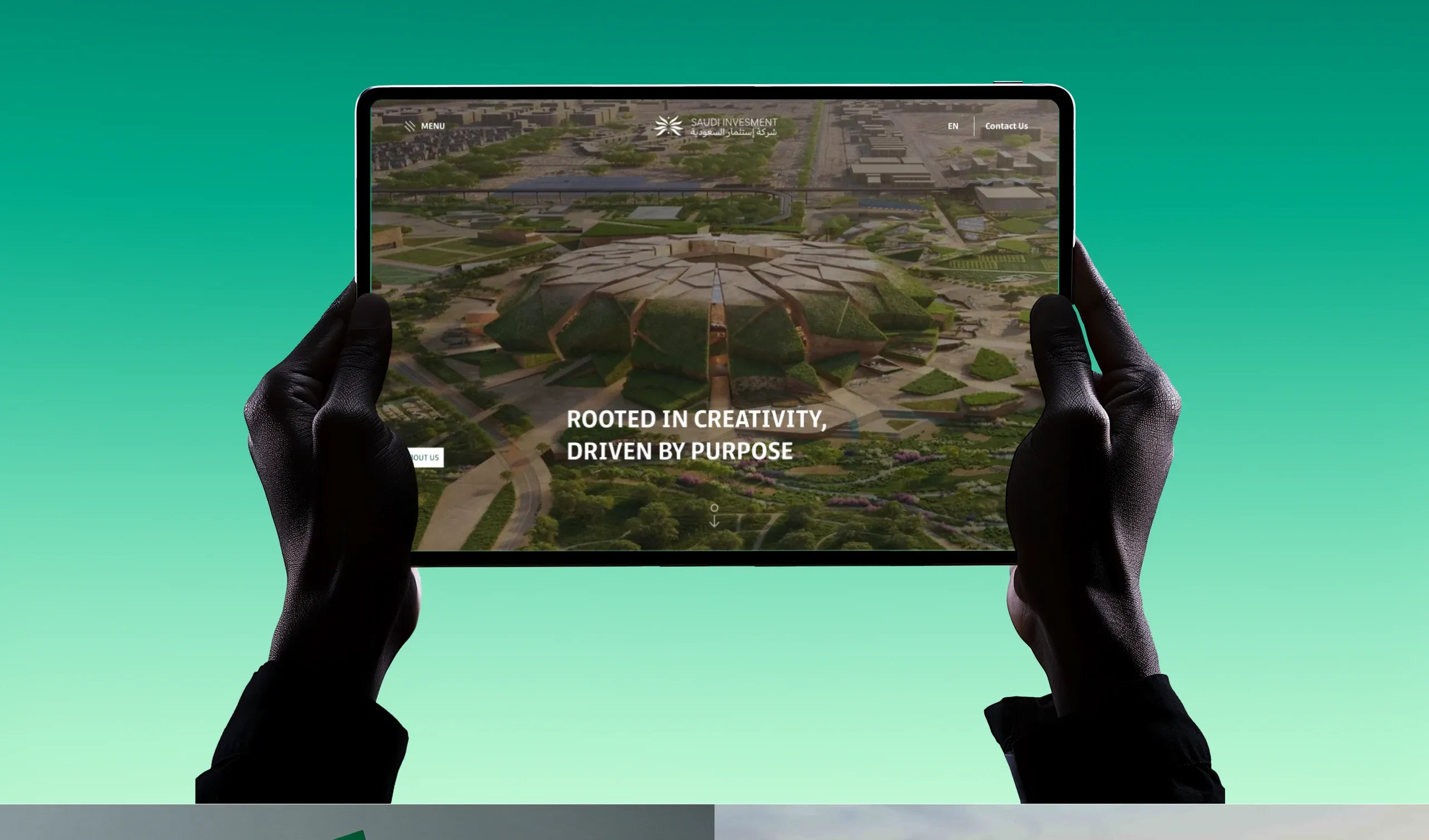
- About. "Rooted in creativity, driven by purpose", with values, mission and a company timeline.
- Projects. A grid filtered by region, featuring projects like Qurtobah Commercial Center, 4Jubail and Al Aziziya Plaza.
- News and contact. Insights on real estate in Saudi Arabia, and a contact page with the Riyadh and Al Khobar offices.
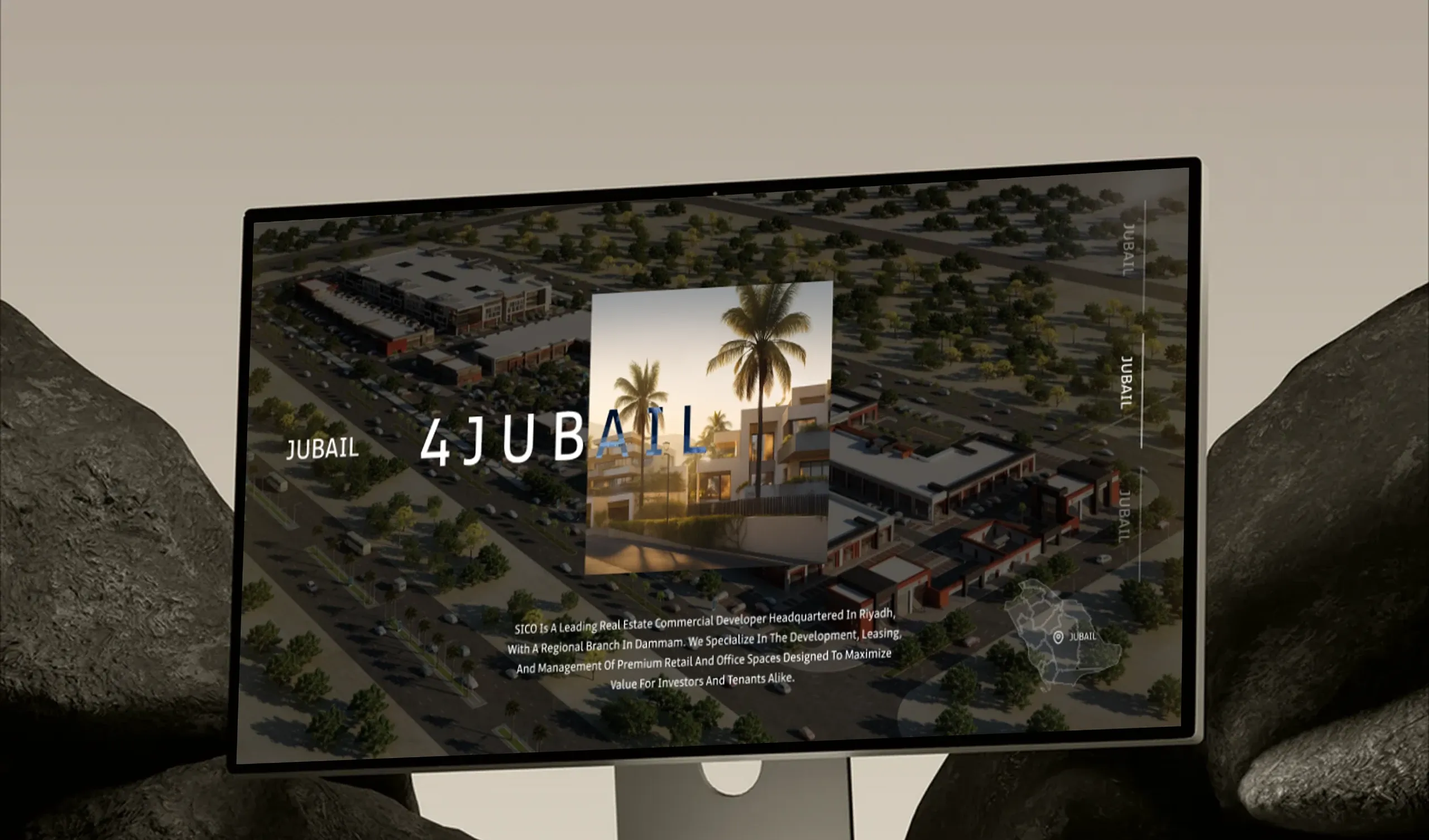
What I Had to Work With
Starting from an existing prototype meant refining rather than reinventing: keeping what worked, sharpening the hierarchy and making every page hold up across four breakpoints, from a wide desktop down to a 360px phone.
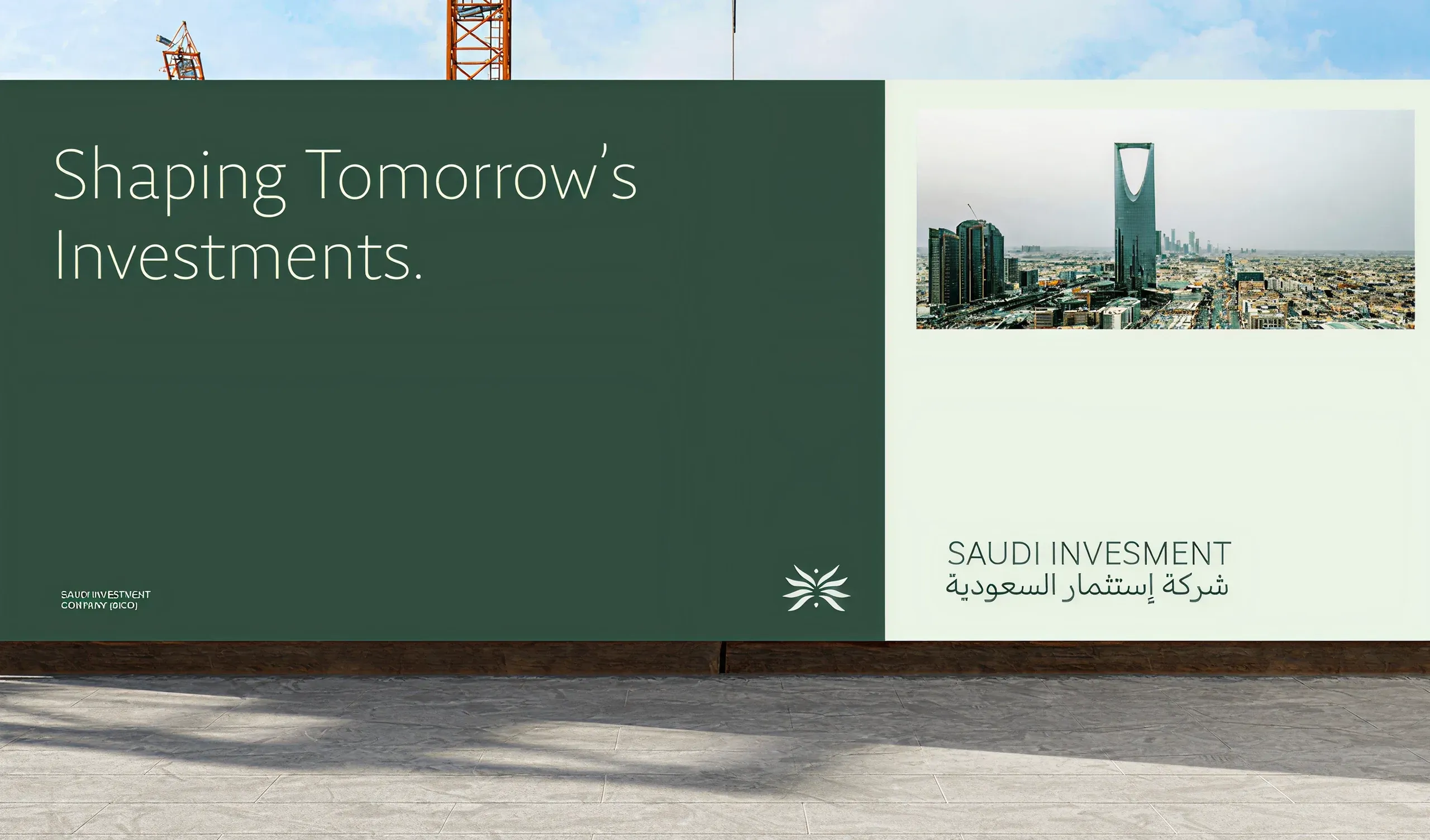
What I Learned
Let the architecture lead. Big imagery and restrained UI did more for credibility than any decorative detail.
Clear claims sell. A short, confident line like "No middlemen. No delays. Just results." explained the business model better than a paragraph could.
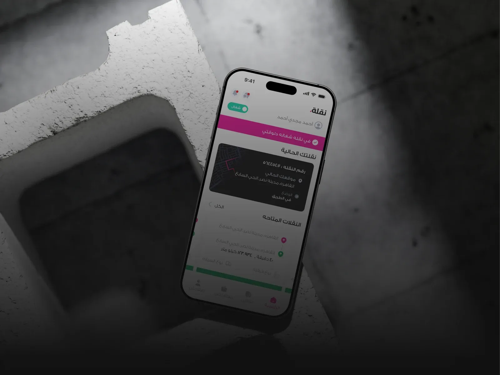
Naqla Driver App
Truck drivers work from the road, so their app has to work for them, even offline.
LogisticsMobile app