


Pirelli App
Buying tires should feel as confident as driving on them.

- Role
- Lead UI/UX Designer
- Timeline
- 2 weeks
- Team
- Pimula Agency
- Platform
- Mobile app
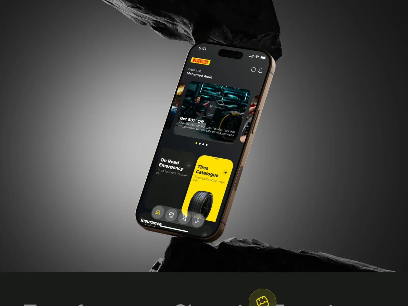
The Real Problem
Pirelli is a renowned Italian tire manufacturer, founded in 1872 and known for high-performance tires for cars, motorcycles and bicycles, with a strong presence in motorsport. But buying tires is rarely a pleasure: people struggle to know which tire fits their car, whether it is in stock and where the nearest trusted dealer is.
The goal was a shopping app that makes it effortless to discover, shop and save, all at your fingertips. This e-commerce mobile app UI/UX design had to feel as premium as the brand and as simple as any everyday shopping app.
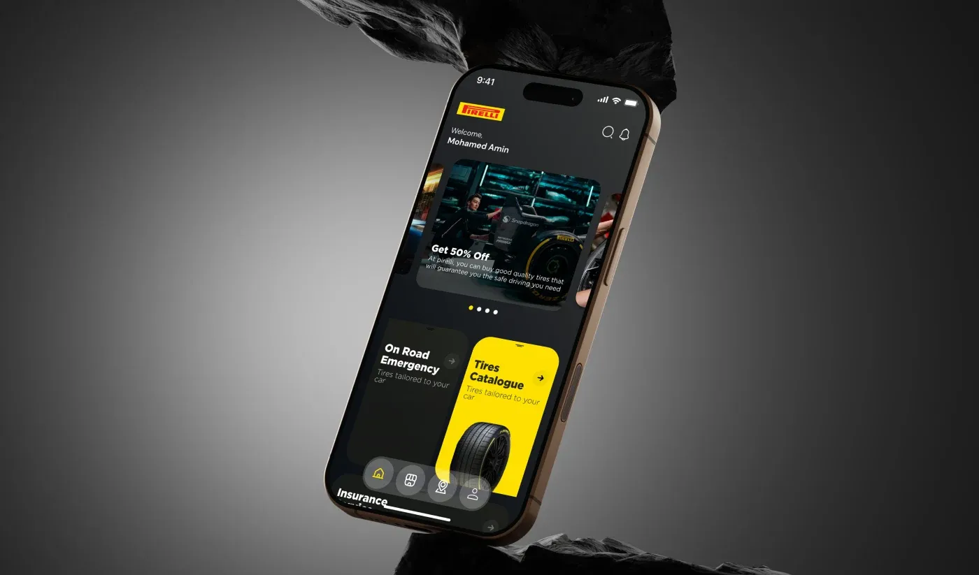
Finding the Fix
I focused the app on three moments where shoppers lose confidence:
- Product discovery. Product pages that put the features that matter first, so people understand a tire before they buy it.
- Stock discovery. A catalogue that is easy to browse and check every day, with new items and offers up front.
- Location services. A store finder with directions, ratings and travel time to the nearest dealer.
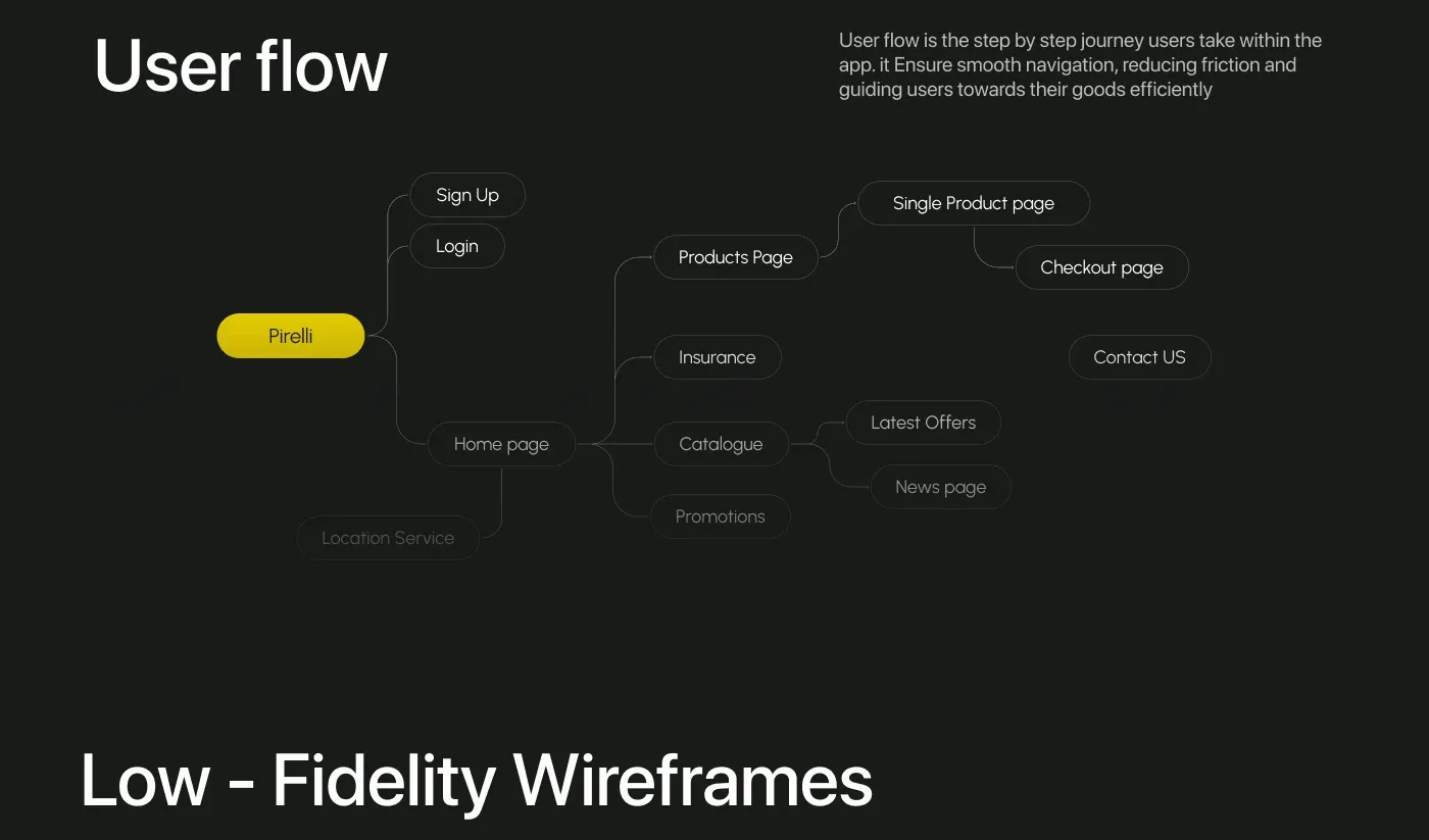
Mapping the Journey
Before any visuals I mapped the user flow, the step-by-step journey from sign-up and login to the home page, then into products, a single product and checkout, plus insurance, the catalogue, promotions, offers, news and the location service. Low-fidelity wireframes followed, so the structure was agreed before the styling started.
Sign-in got special attention, because life is too short to be wasted on sign-ins: log in with a phone number, recover a password with a code, or create an account in one short screen.
What I Designed
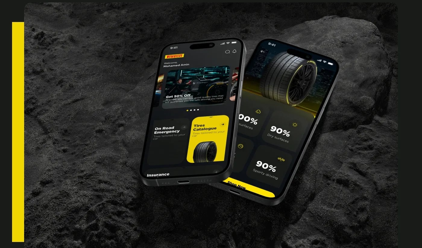
- Home. Featured offers, on-road emergency help, the tire catalogue and insurance, all one tap away.
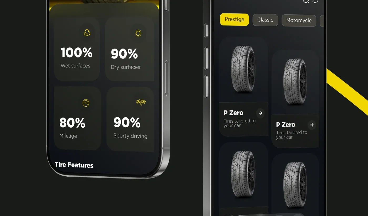
- Product. A clear tire page with the numbers shoppers compare: wet and dry grip, mileage and sporty driving.
- Catalogue. Collections like Prestige, Classic and Motorcycle, with P Zero tires tailored to your car.
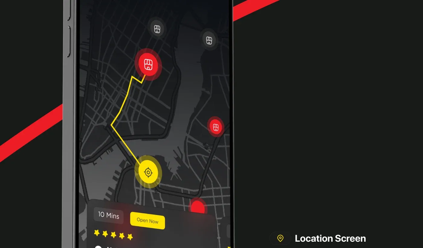
- Location. Nearby stores on a map with ratings, opening status, travel time and directions.
The Visual System
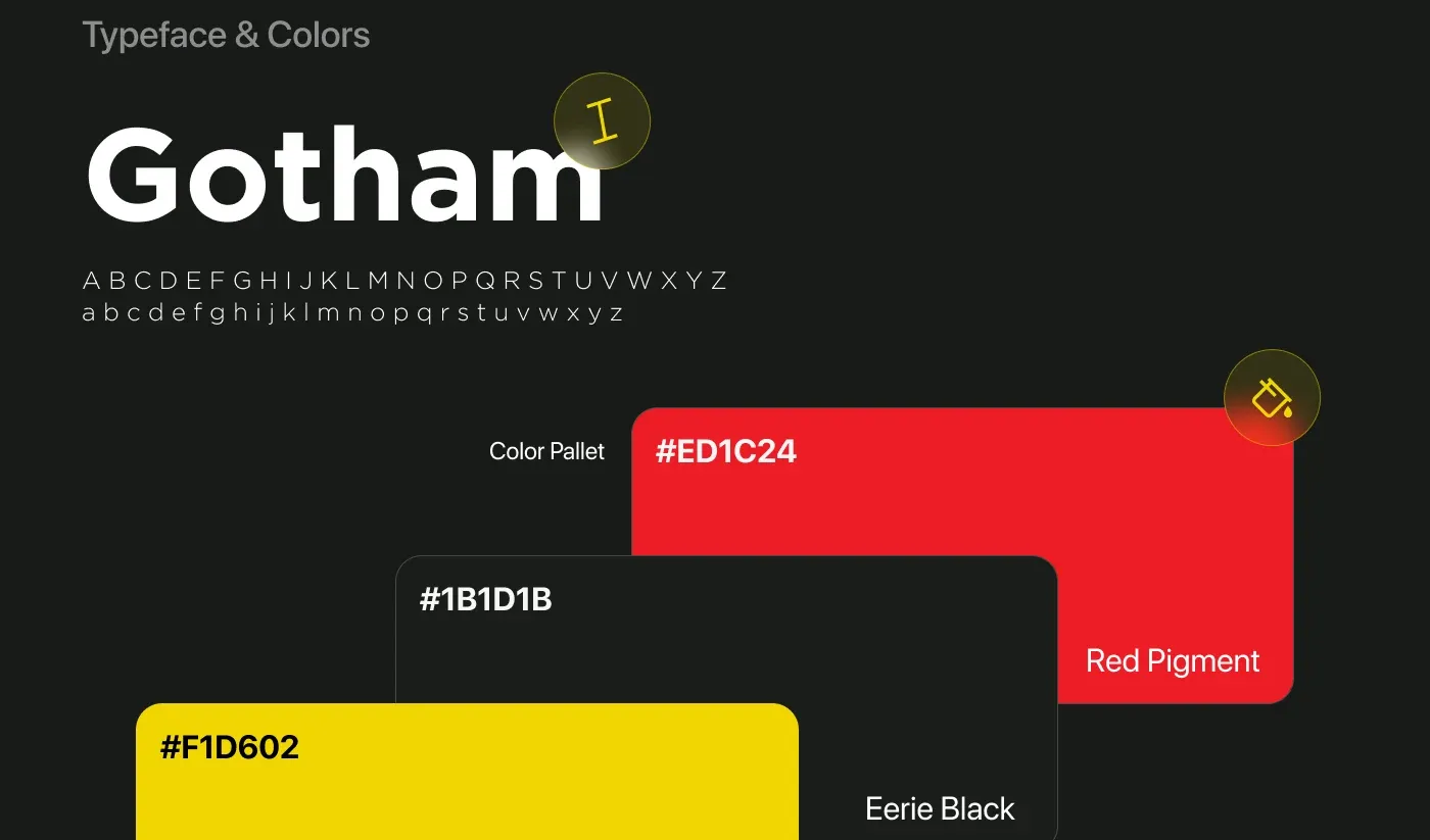
Gotham carries the brand's confident voice, on a palette of Pirelli's Safety Yellow (#F1D602), Red Pigment (#ED1C24) and Eerie Black (#1B1D1B). The dark interface lets the tires and the yellow accents do the talking, just like Pirelli's motorsport identity.
What I Had to Work With
Two weeks, one designer and more than 24 screens, directed by Pimula on a really tight deadline. That meant mapping the flow and agreeing on wireframes early, then reusing one set of components across every screen, so the time went into the experience rather than redrawing the same parts.
Stanly Egypt
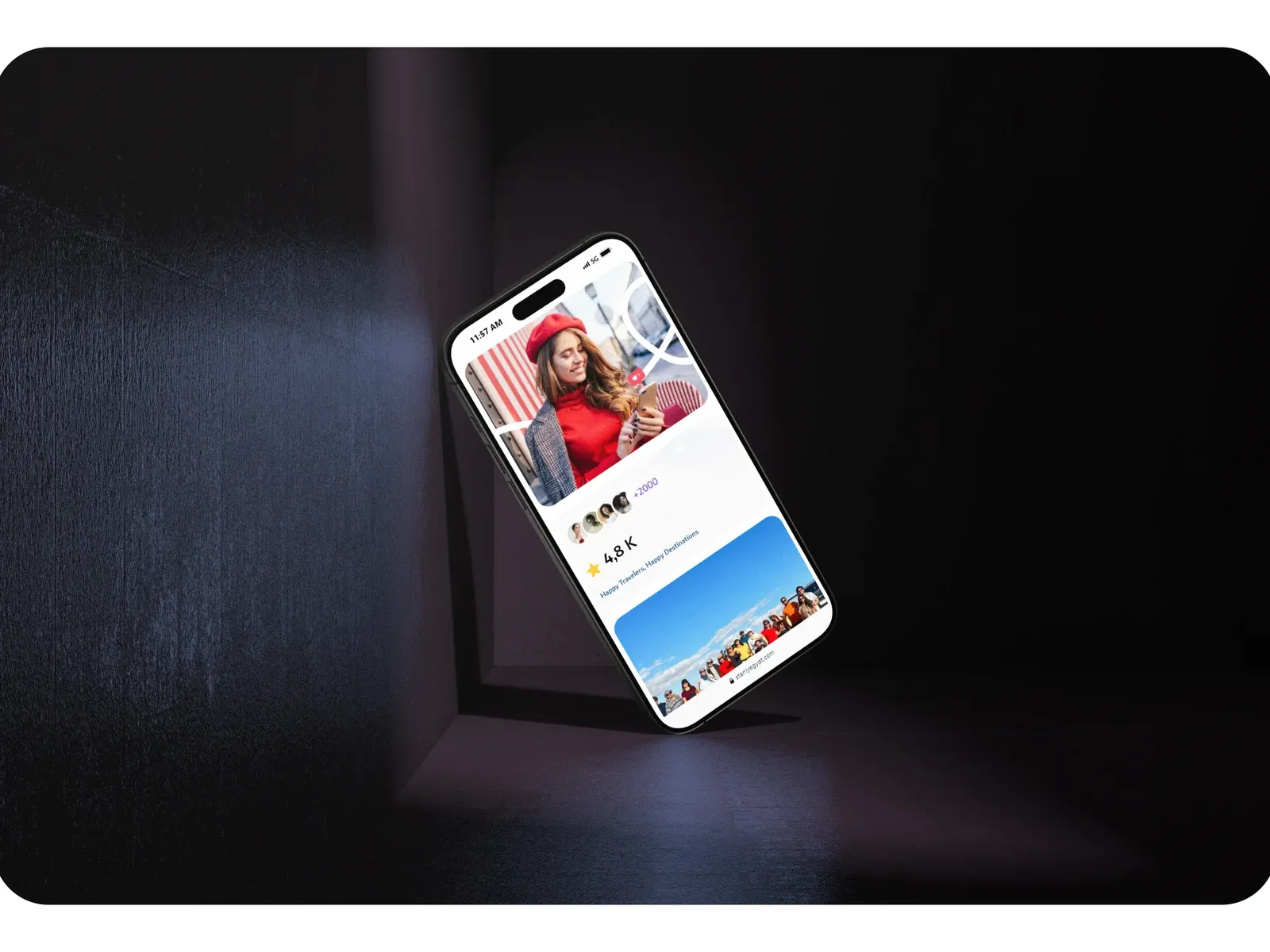
The world was made to be explored, and booking it shouldn't feel like paperwork.
TravelWebsite