


Stanly Egypt
The world was made to be explored, and booking it shouldn't feel like paperwork.

- Role
- UI/UX Designer
- Timeline
- 2024
- Team
- Solo designer
- Platform
- Web & mobile
The Real Problem
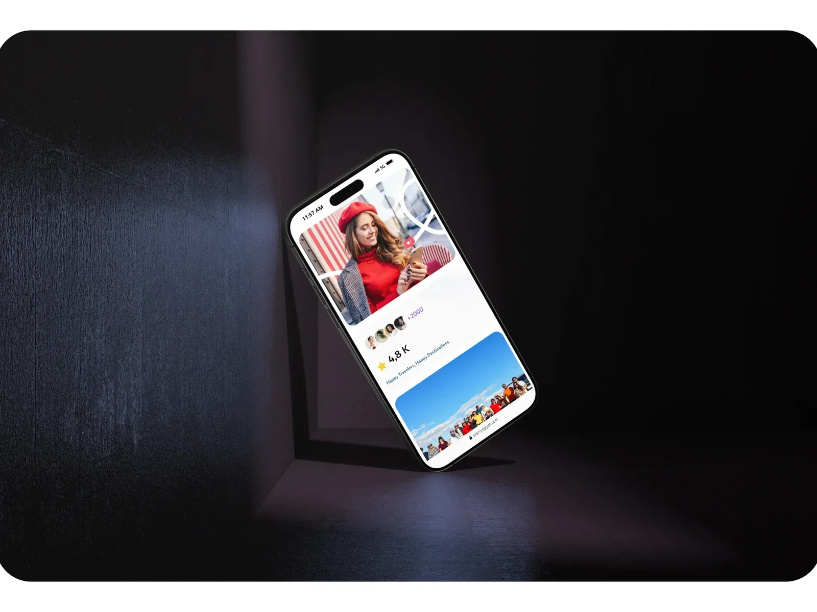
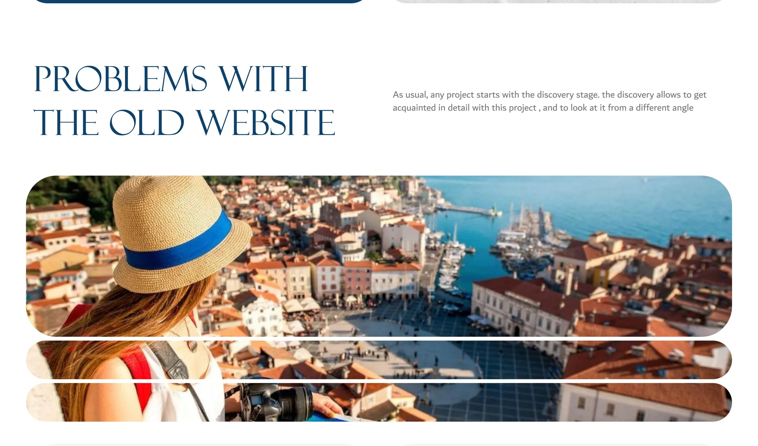
Stanly Egypt sells luxury travel to high-end travelers, but its old website said the opposite. Discovery for the travel website UI/UX redesign showed four problems:
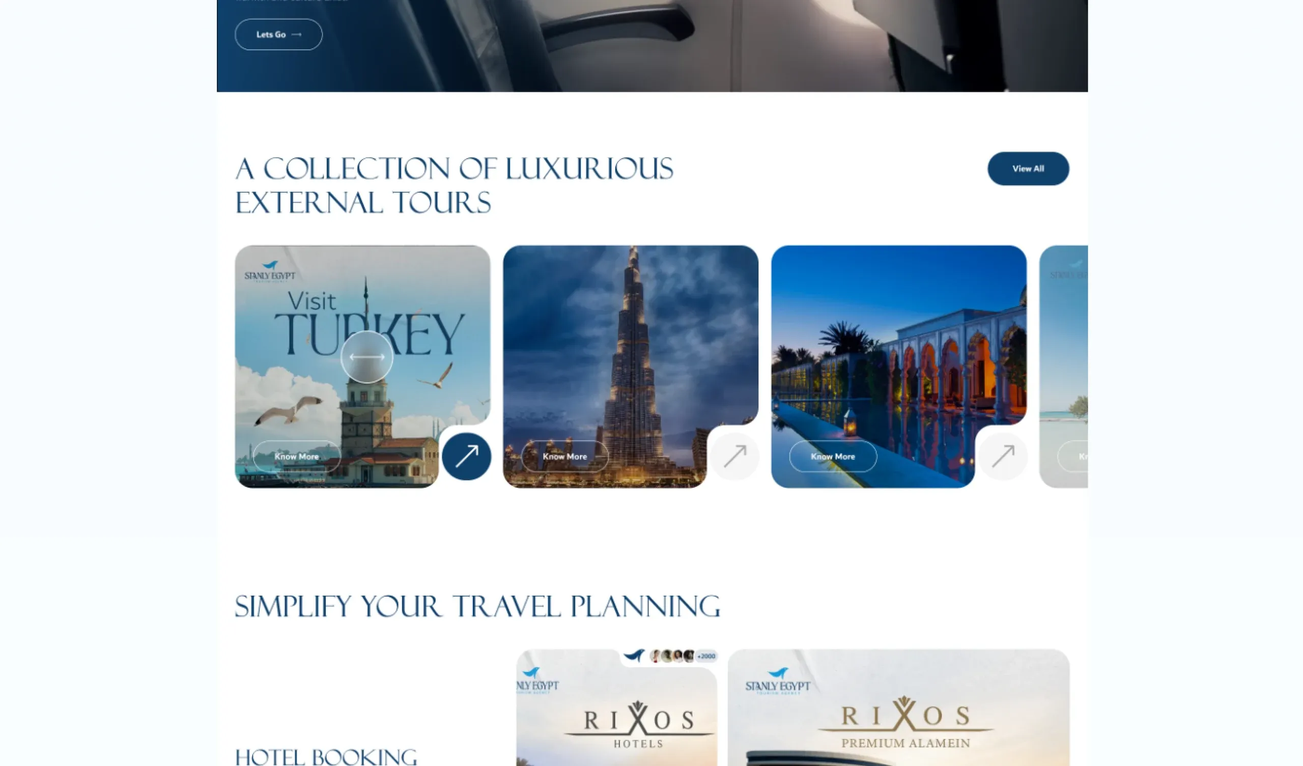
- An outdated design. Dated and cluttered, it failed to reflect the exclusivity of the brand.
- Little visual appeal. Low-quality imagery and almost no interaction for destinations that should sell themselves.
- A heavy booking flow. Too many unnecessary steps, and lower conversion because of it.
- Confusing navigation. Information was hard to find, so people gave up before booking.
Finding the Fix
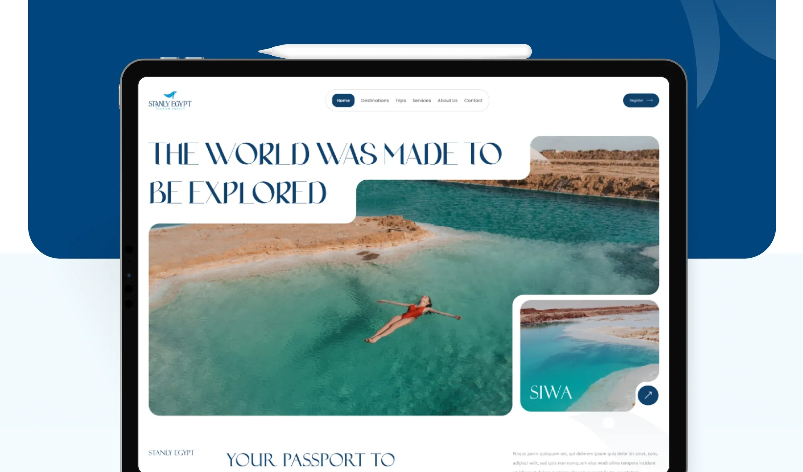
I directed the end-to-end UI/UX with one aim: an elegant platform that conveys exclusivity while staying effortless to use. That meant a refreshed visual system (typography, color and iconography) consistent across web and mobile, and journeys rebuilt around how travelers actually plan.
What I Designed
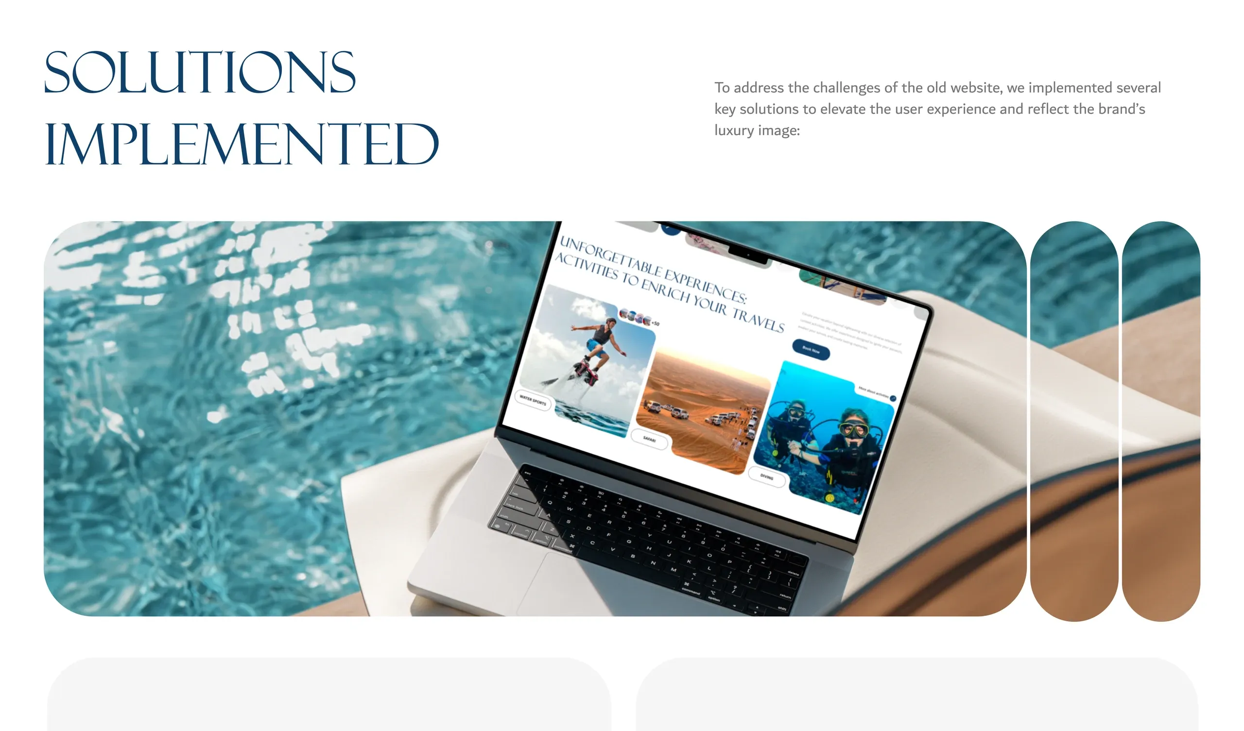
- Curated packages and personalized recommendations instead of endless lists.
- Immersive visuals: high-quality photography, video and interactive elements that capture the feeling of the trip.
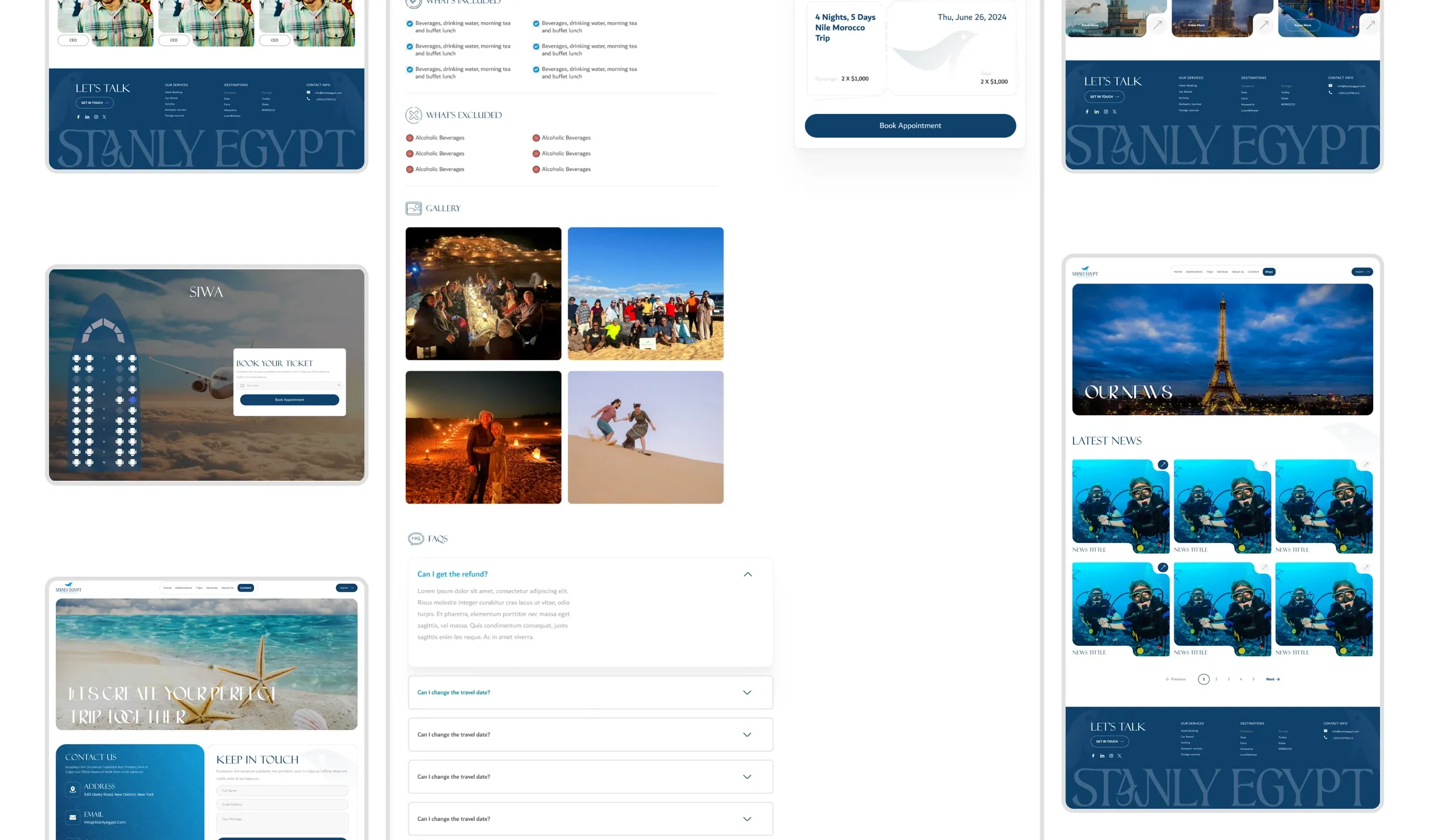
- A streamlined booking flow with fewer steps, detailed itineraries and an interactive map of destinations.
- A clear, organized layout so travelers go from discovery to booking without friction, set in the elegant Felix Titling.
What Changed
- Conversion rate up 20% in A/B testing of the new flows.
- Brand recognition improved by 25%.
What I Learned
Luxury is the absence of friction. The most premium thing the site could do was make booking feel easy.
Test before you roll out. A/B testing the new journeys with real users turned design opinions into evidence.
Secure Me
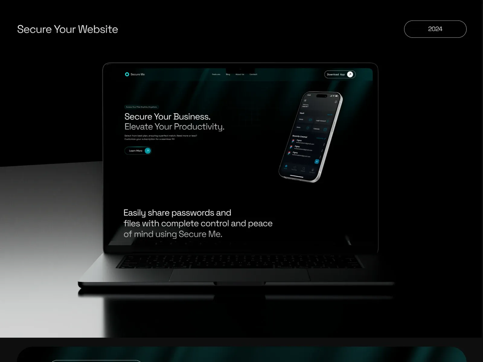
Security shouldn't be a privilege for the few, and it shouldn't look complicated either.
SecurityWebsite